rebranding the
Bank of the West
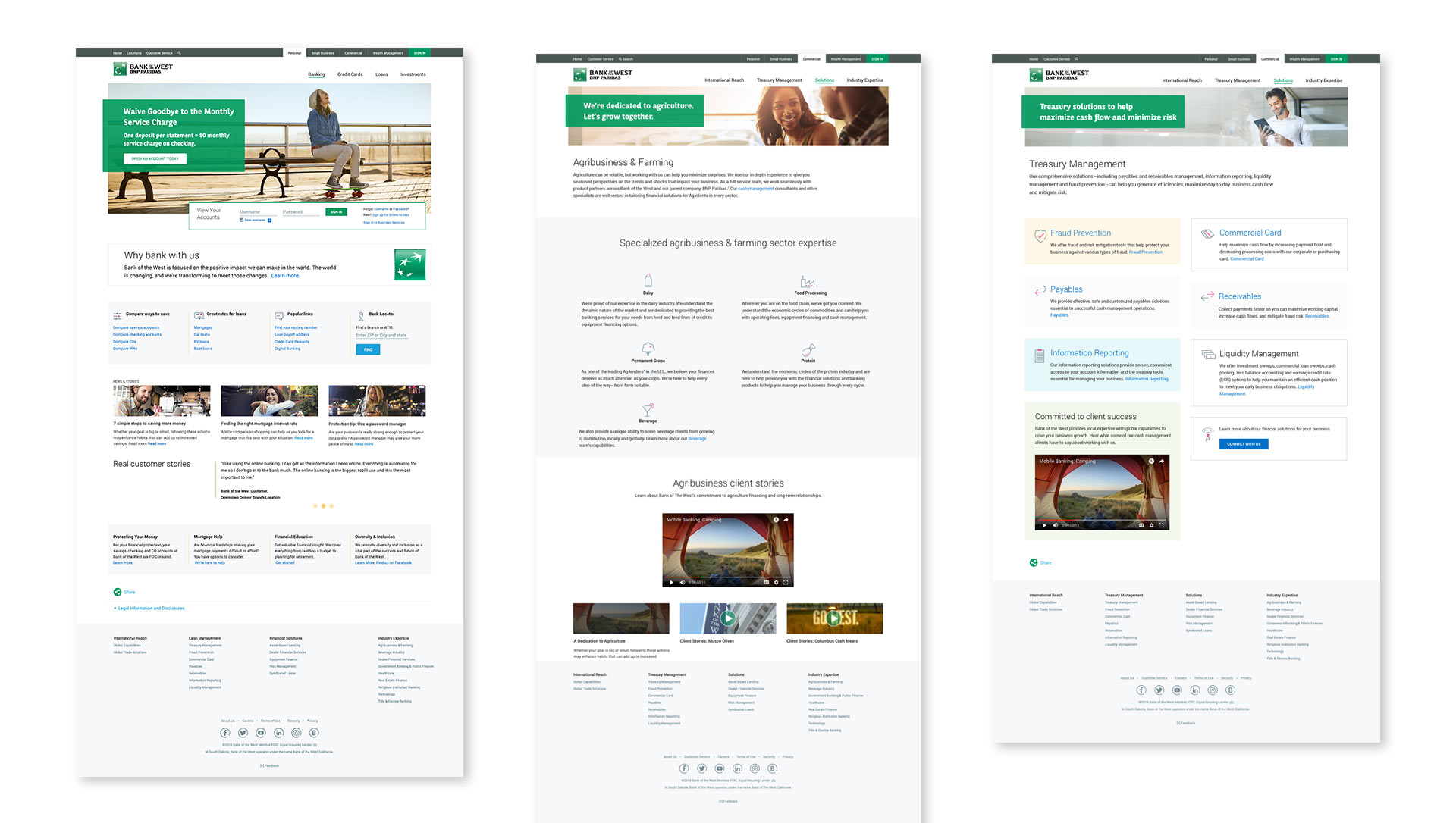
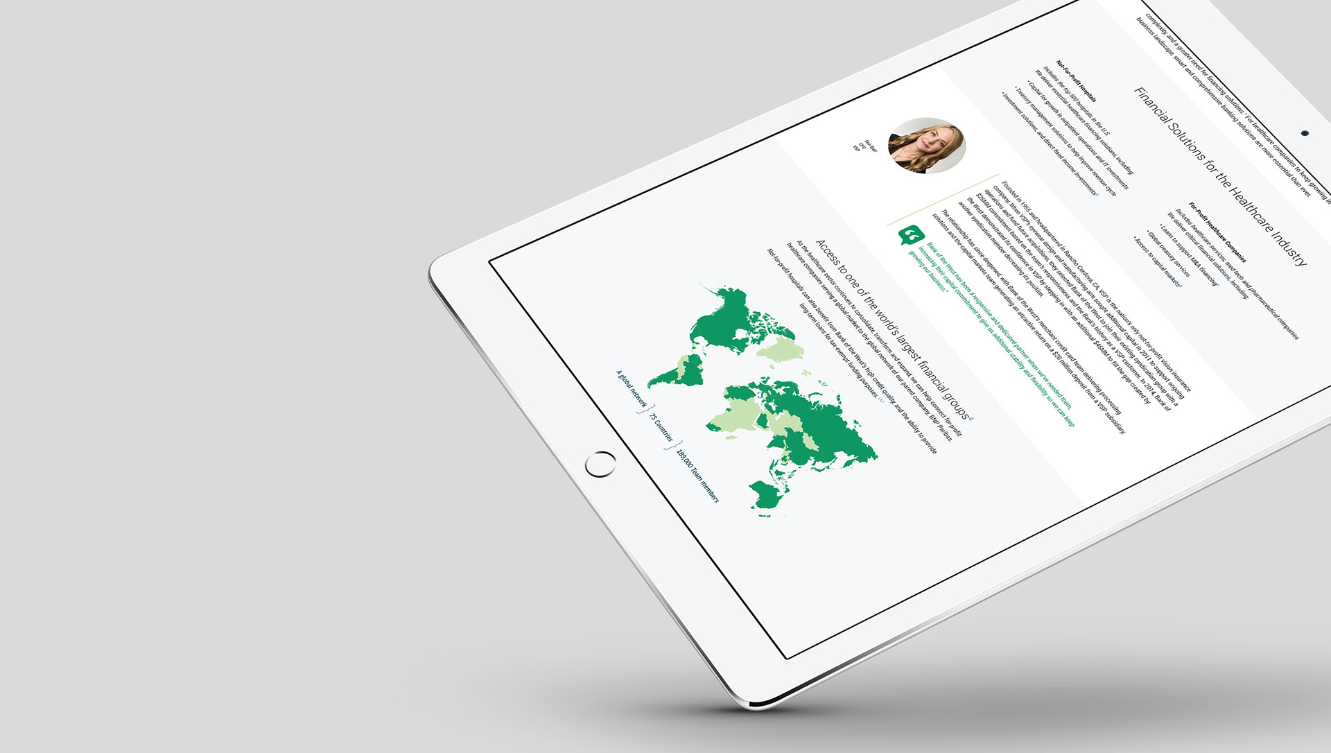
Assigned with rebranding and designing a responsive sales experience and authenticated online banking site, I served as the principal visual UI designer, collaborating with a multidisciplinary team comprising of designers, researchers, content strategists, and engineers.
Our primary objectives were to boost online registration, streamline redundant pages, enhance mobile utilization, identify and address user drop-off points, and ensure straightforward navigation.
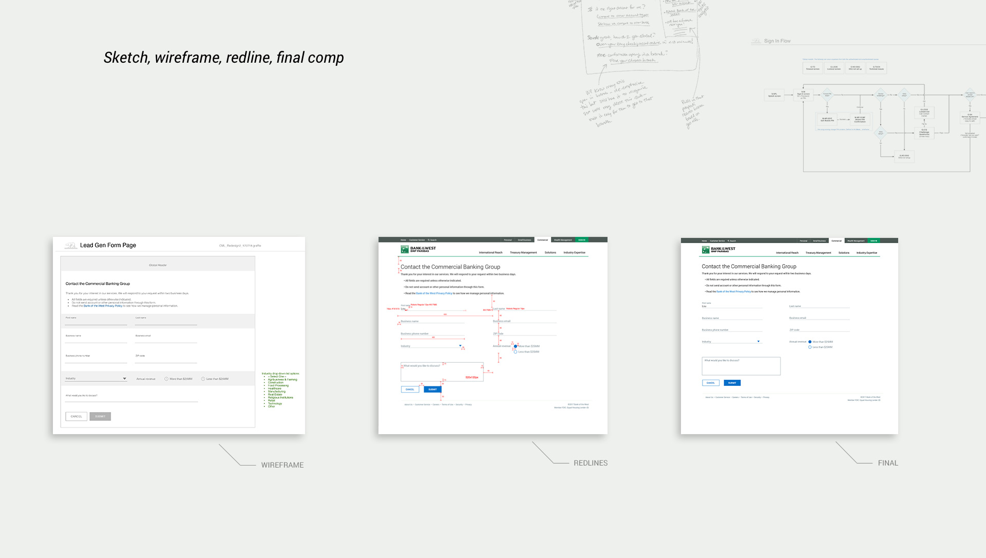
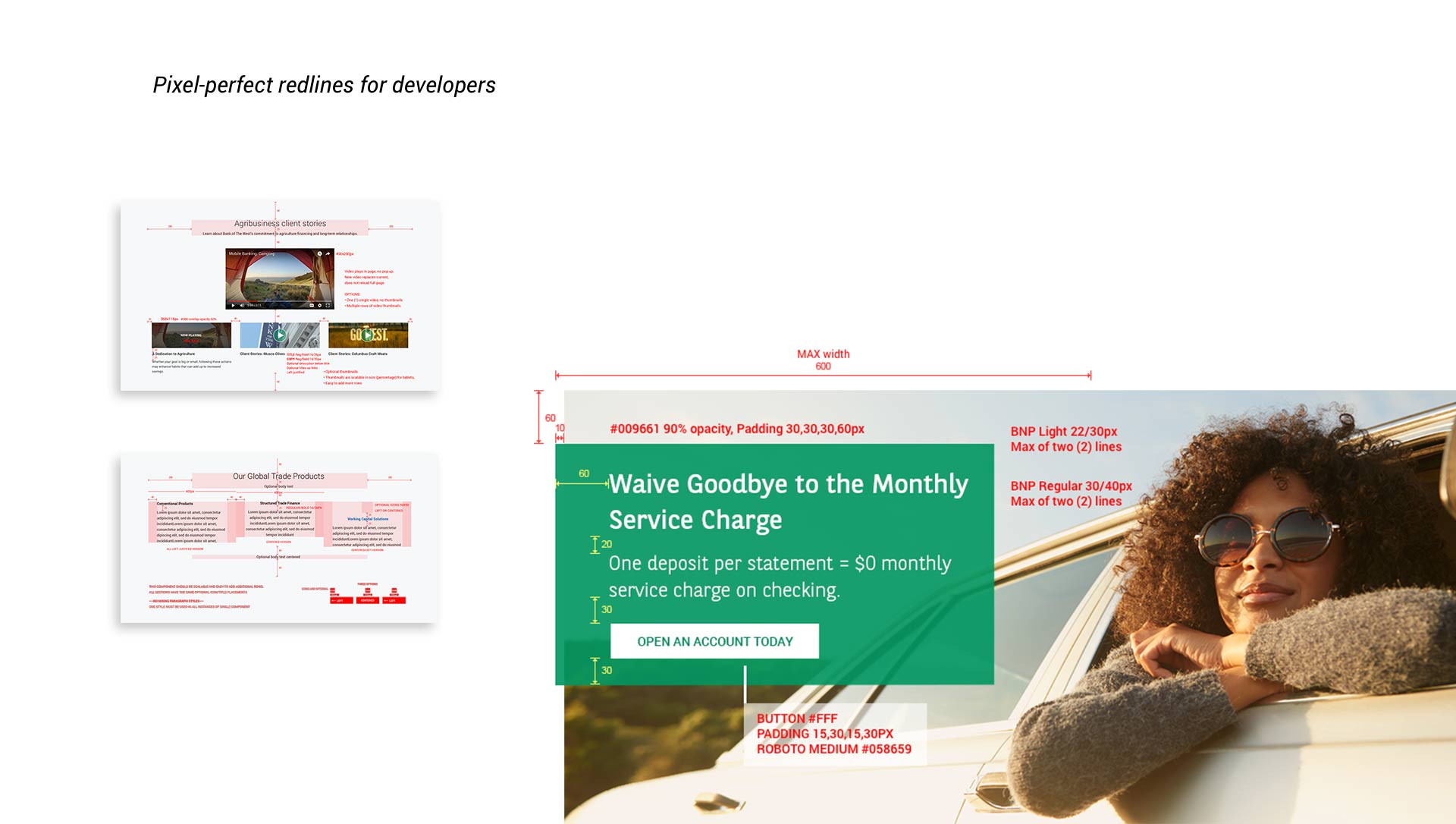
Our approach was heavily influenced by research and data, guided by user-centered design principles to deliver top-notch visuals from conception to implementation. Final compositions and meticulously detailed redlines were passed on to development for implementation.
We leveraged research insights, personas, and journey maps to create wireframes and prototypes. Continuous feedback through focus groups and A/B testing played a crucial role in refining the design and flow.
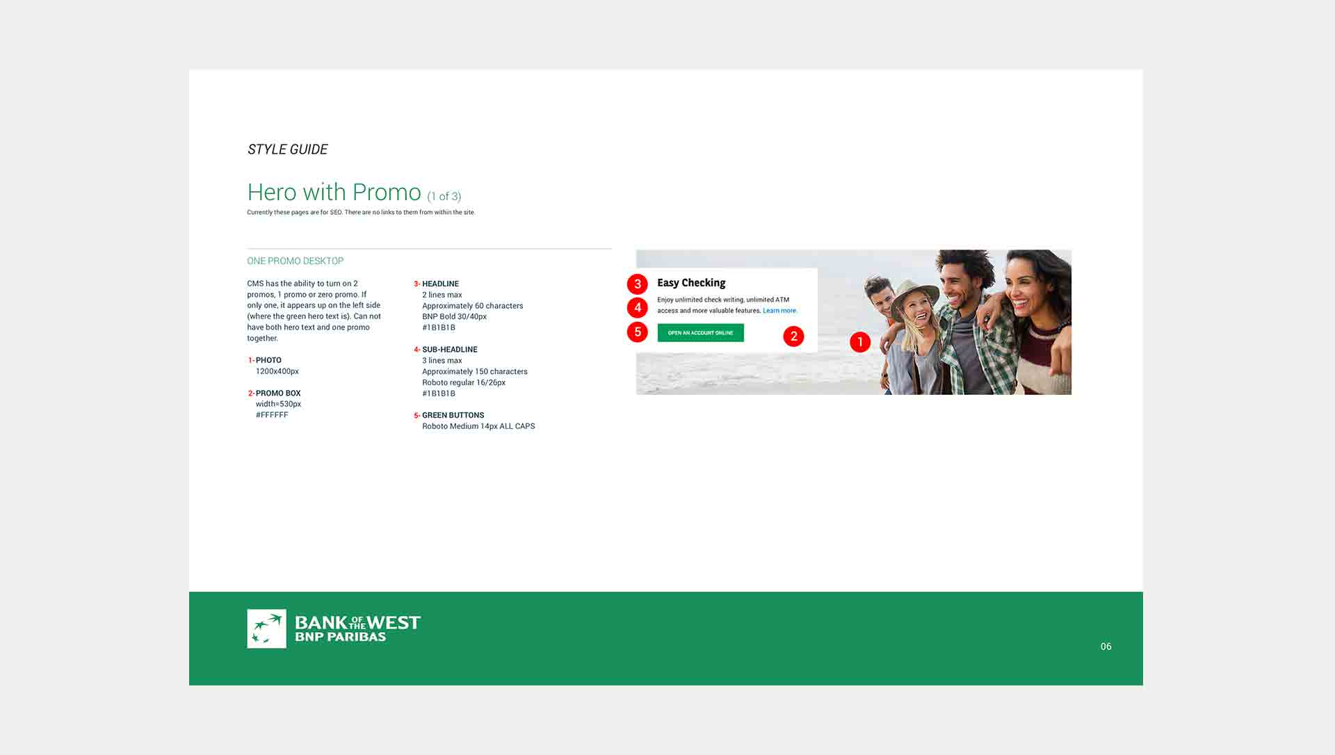
We assembled each page component into a pattern library, enabling our team to reuse them across all business units with a CMS. This approach significantly reduced reliance on engineering resources, saving both time and money.
The outcome was a visually appealing and ADA accessible site. Within the first month, registration increased by 136% and continued to grow. We streamlined over 500 pages to 100+, witnessed a rise in mobile usage, and significantly improved site navigation.
I was actively engaged in the entire product life cycle, from conceptualization to launch, ensuring a seamless and successful outcome.
| Bank of the West | |
| Title: |
Principal Visual Designer / Sr User Experience Design Analyst |
| Roles: |
|

 need to update
Internal team building video
Internal web launch video