DeepSee.ai
As the founding designer, I led the end-to-end UI/UX design for DeepSee, simplifying complex AI/ML technologies for the Capital and Financial Markets. I specialized in developing user-friendly dashboards and AI solutions that transformed intricate backend systems into intuitive experiences.
Key achievements include:
- Automated the reconciliation process, improving accuracy from ~60% to 99%.
- Built and implemented design libraries that ensured consistency and streamlined workflows.
- Conducted user research, testing, and designed ADA-compliant interfaces to meet accessibility standards.
- Collaborated closely with Product, Engineering, and stakeholders to deliver tailored, effective solutions throughout the product lifecycle.
- Contributed to a specialized version of ChatGPT and a GenAI-powered email composer for the financial sector, both customized for unique user needs.
|
Senior UX UI Designer, Creative Lead
|
Quick Overview
A 46 second video of the DeepSee apps. Created with After Effects and Figma.
Customized ChatGPT for Capital Markets
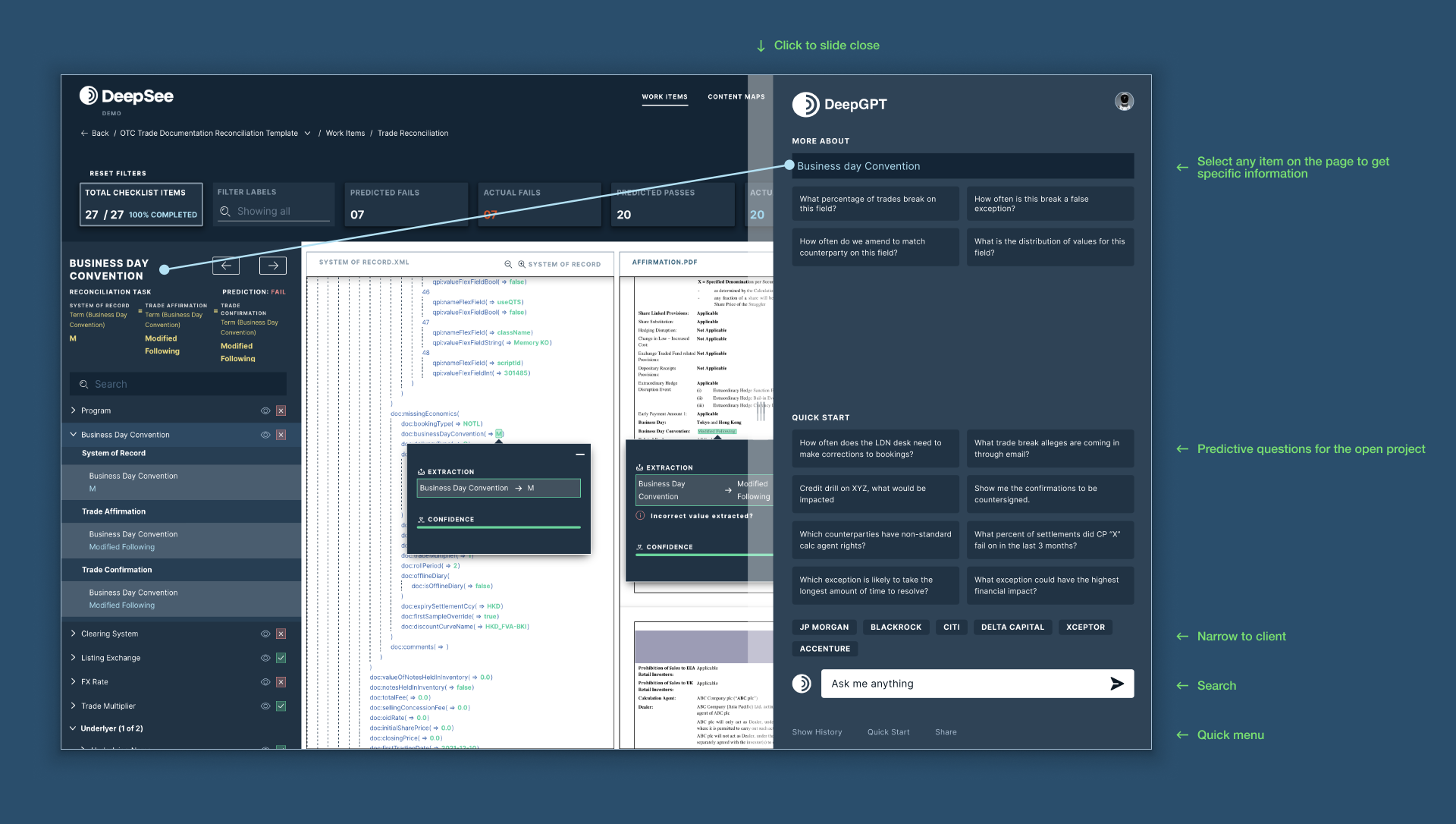
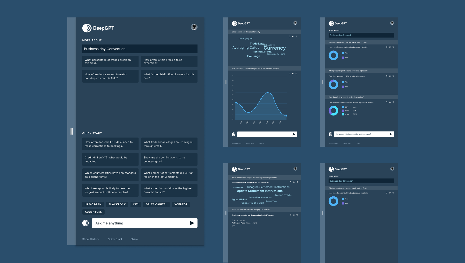
↓ Develop a version of ChatGPT tailored for highly regulated industries like Capital Markets, optimizing its visual organization and usability. The tool needed to provide clear visibility across various projects, offer valuable visualizations, and handle complex inquiries regarding unstructured content and processes.
I led an iterative design process, working closely with the product team and engineers. We explored multiple layouts, refining the visual structure and usability through a working prototype. Our focus was to provide comprehensive project visibility with detailed visualizations, while equipping ChatGPT to handle complex queries efficiently.
We successfully developed a customized version of ChatGPT tailored for Capital Markets. The iterative design process significantly improved the tool’s usability and visual organization, providing users with clear project overviews and actionable visualizations. Additionally, we equipped ChatGPT to handle complex inquiries about unstructured content, ensuring users could access precise answers efficiently.
By focusing on user needs and applying an iterative approach, we successfully developed a highly effective, user-friendly ChatGPT for the financial sector.
I was the lead UI/UX designer, collaborating with cross-functional teams to ensure optimal results. ↓
Dashboards
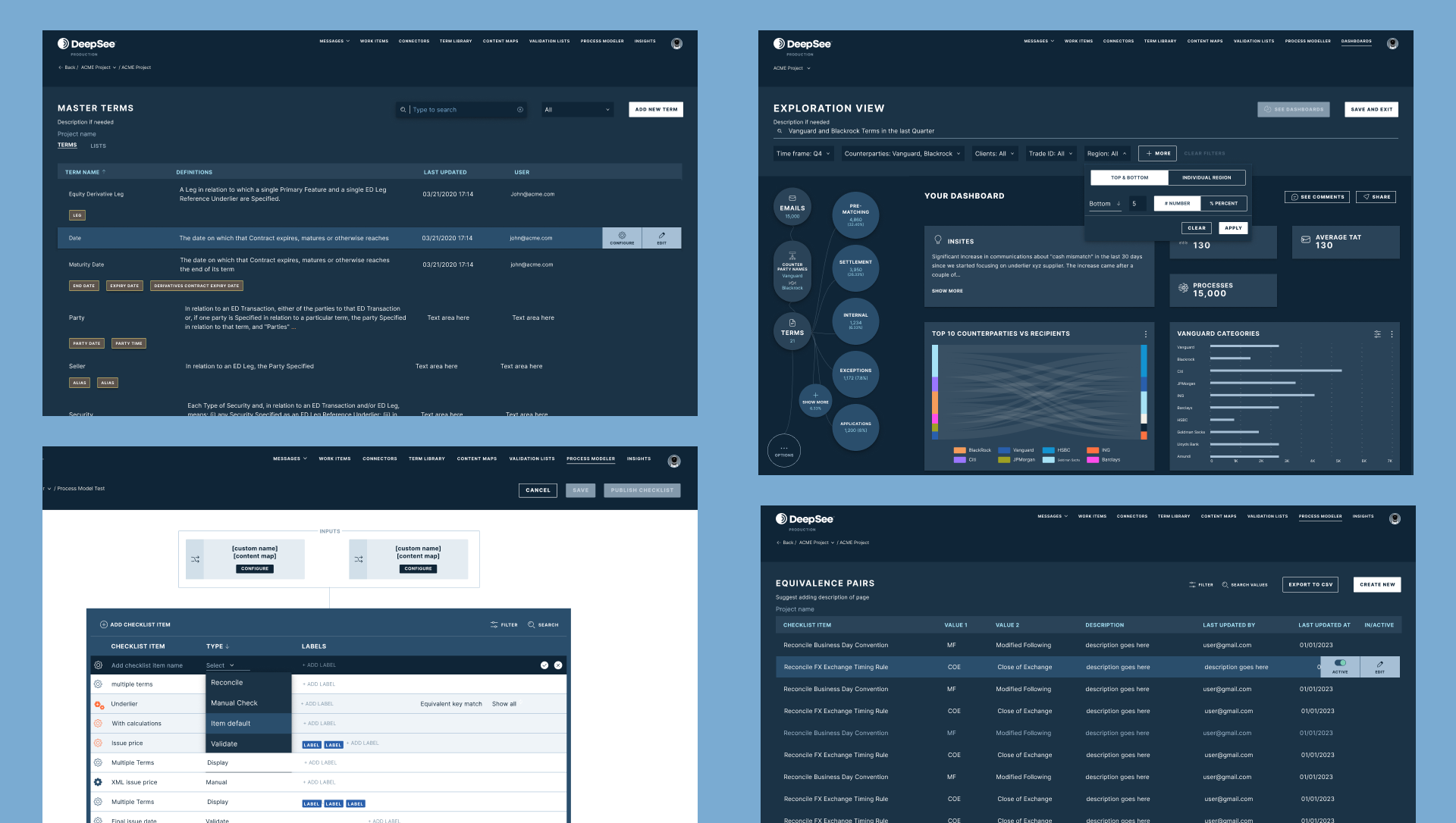
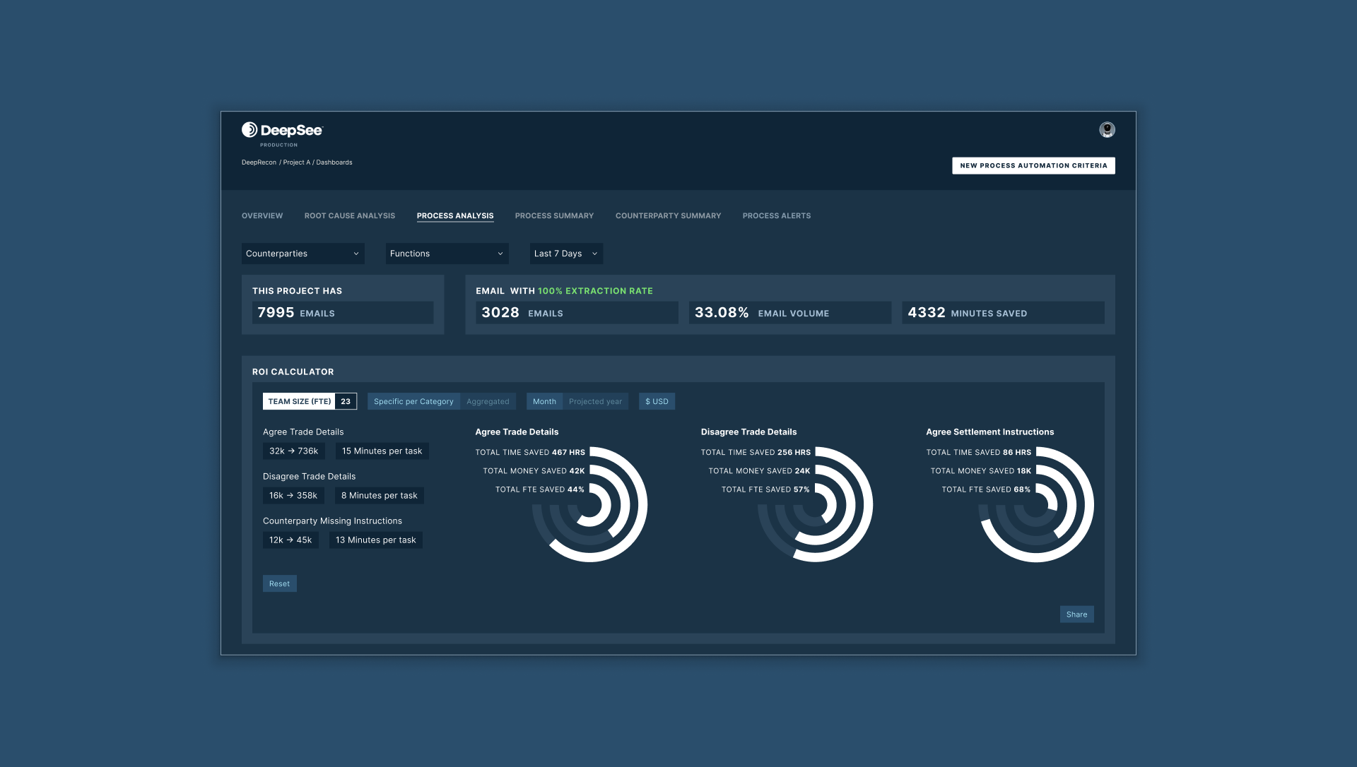
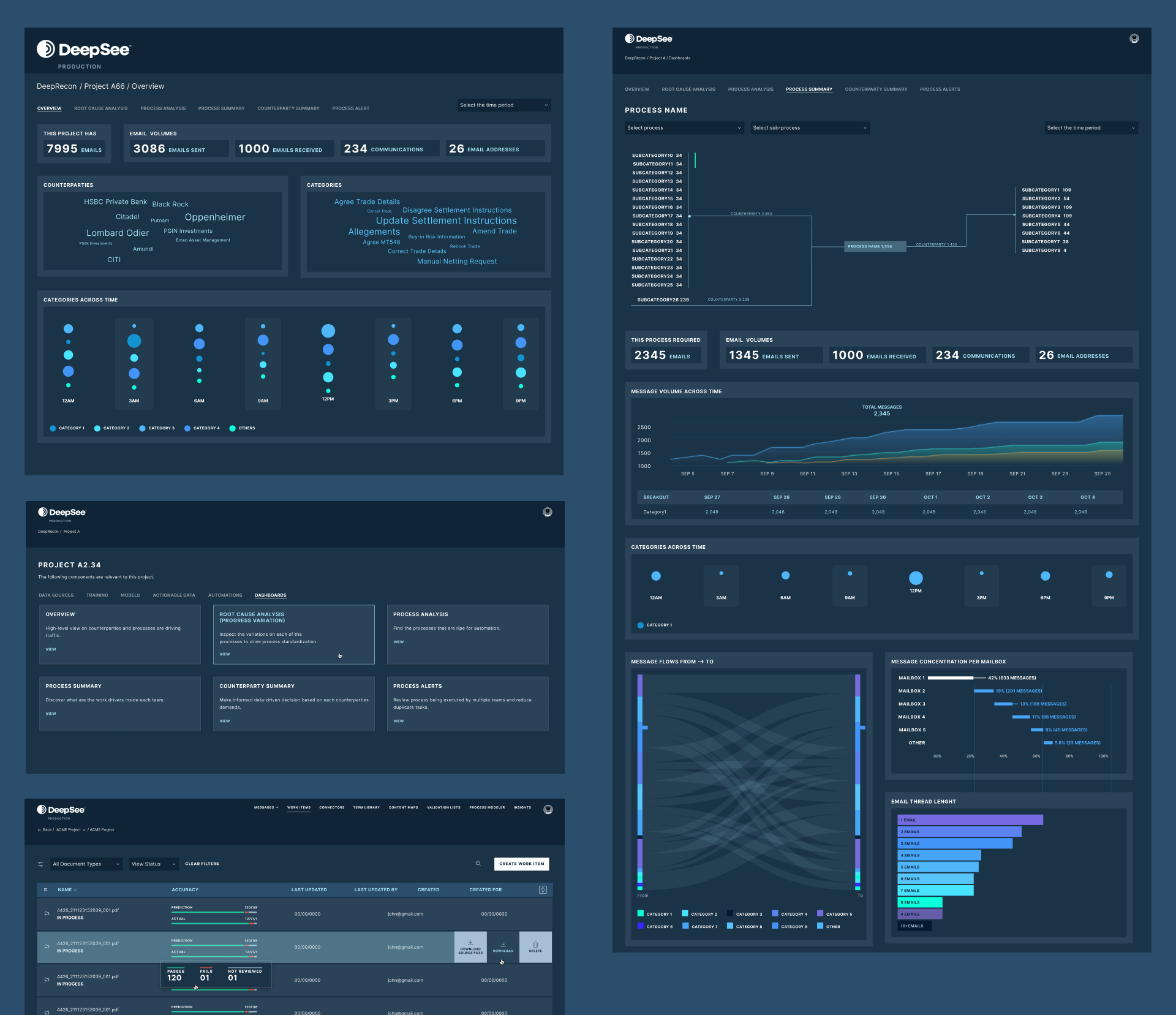
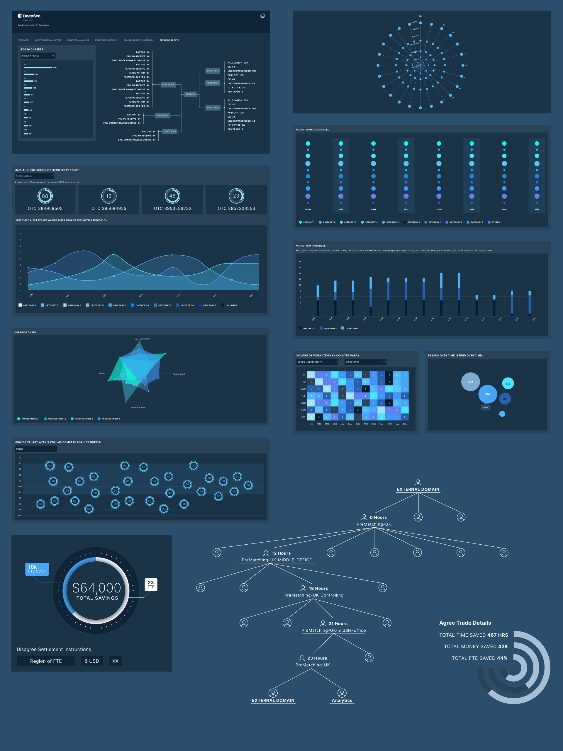
↓ The challenge was to design a visual process discovery solution with multiple unique display methods tailored to each module. I led the effort to refine these designs through an iterative process, incorporating feedback from both in-house experts and clients to guide improvements.
To address this, I developed and iterated on dozens of display methods specific to each module. Continuous feedback ensured the designs evolved to meet the needs of users and stakeholders, allowing for necessary adjustments throughout the process.
The final solution provided users with a versatile toolset for performing diverse analytical tasks, including trend analysis, anomaly detection, predictive modeling, and correlation analysis. It empowered users to extract valuable insights from data, supporting informed decision-making and driving business success.
By applying an iterative design approach and integrating stakeholder feedback, I successfully created a visual process discovery solution that exceeded user expectations.
As the primary UI/UX designer, I collaborated closely with the product team and engineers. ↓
Actionable Data List Creation Process
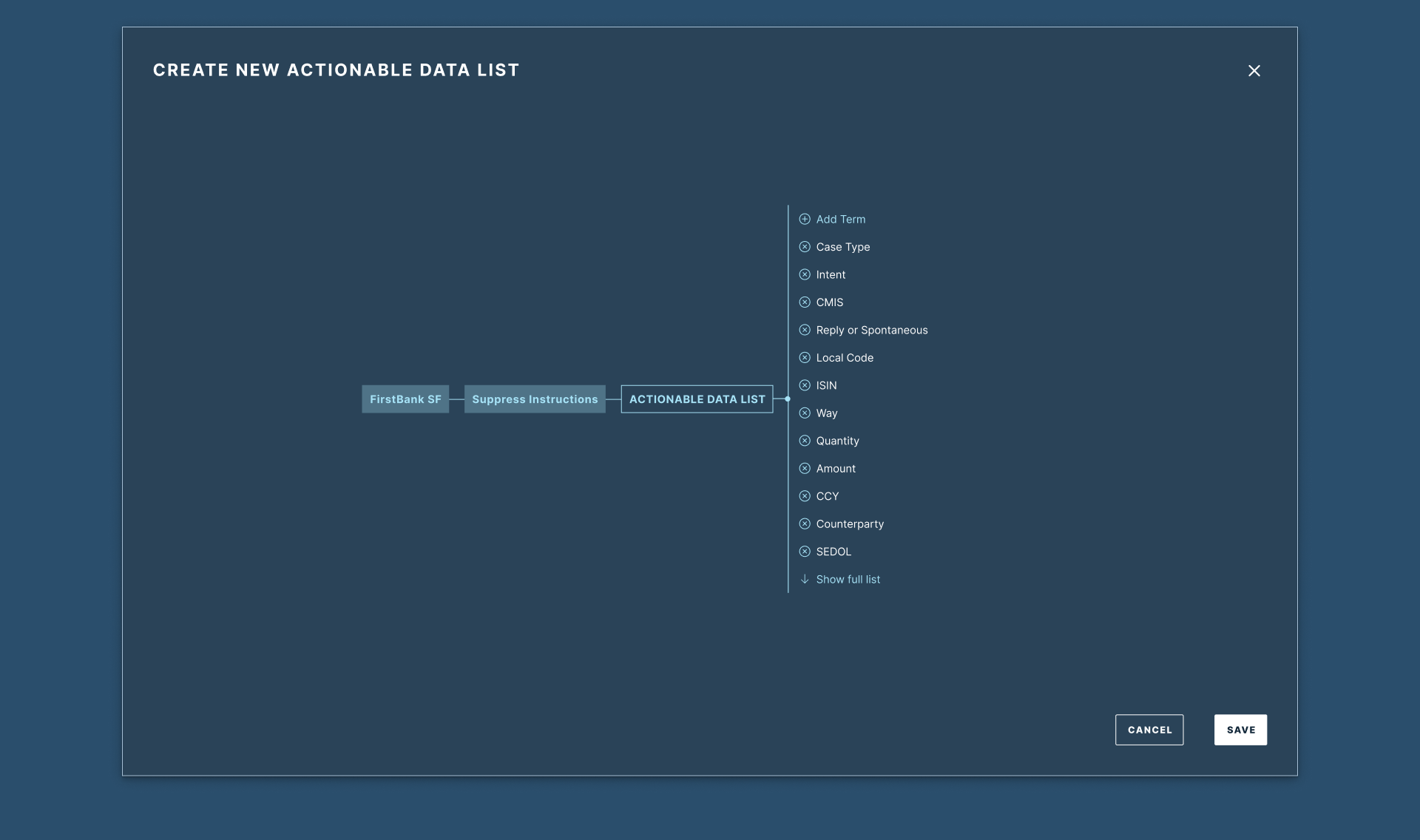
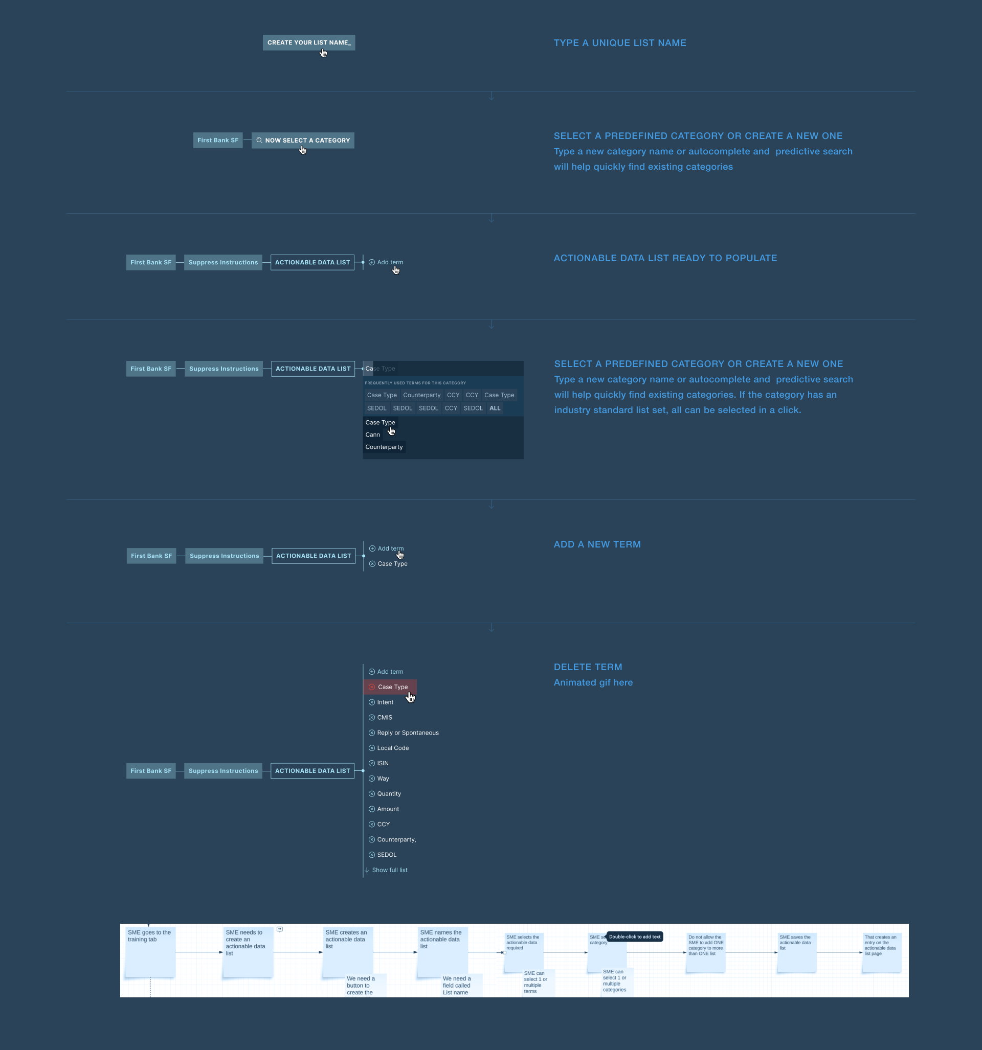
↓ The challenge was to design an intuitive process for creating and editing an Actionable Data List, focusing on a user-friendly flow that integrates seamlessly with existing workflows. The solution required multiple iterations and exploration of new ideas before selecting a final direction.
We developed a working prototype, which was essential for gathering feedback, identifying issues, and refining the design. The prototype helped us incorporate features like autocomplete, predictive search, and editable term sets, enhancing efficiency and saving users time. This iterative approach ensured a smooth, user-friendly experience.
The final solution offers an intuitive, streamlined process for creating and editing Actionable Data Lists. Users can easily navigate the process, using autocomplete and predictive search to enhance productivity. The prototype was key to refining the design, ensuring it met user needs and expectations.
By employing an iterative design process and leveraging the prototype, I successfully developed a user-friendly, efficient solution.
As the primary UI/UX designer, I collaborated closely with the product team and engineers from 0 to 1. ↓
Streamlining Data Reconciliation Process
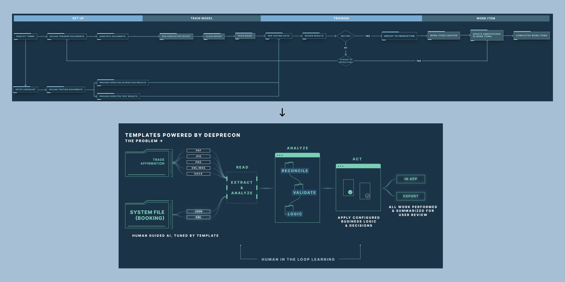
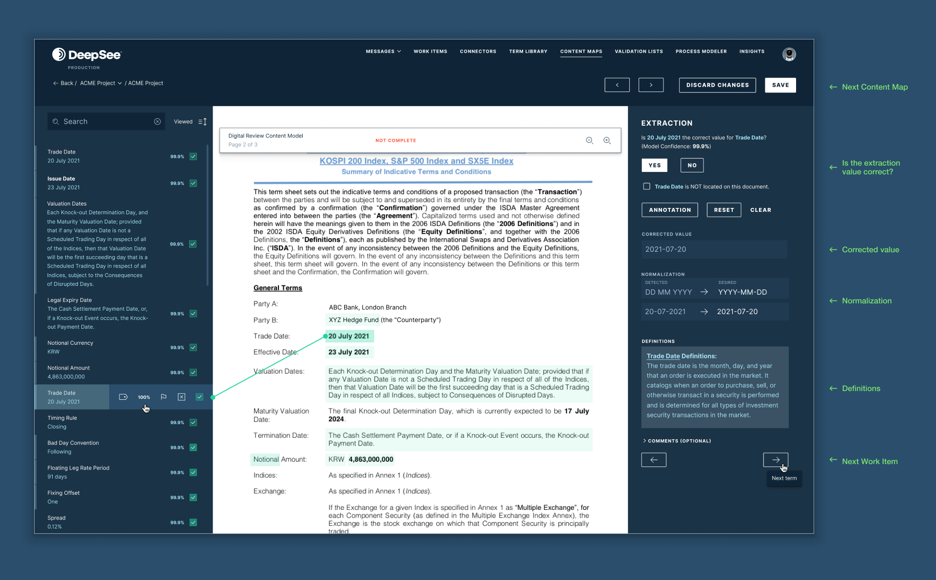
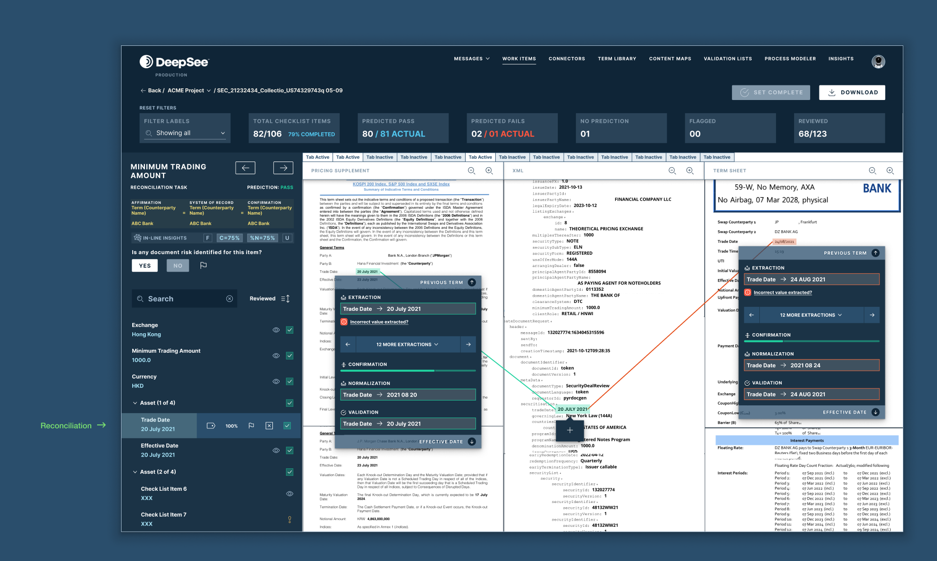
↓ The challenge was to create a user-friendly workflow for the data reconciliation process, automating the manual task of extracting, adjusting, and flagging data from both structured and unstructured sources.
Through a UX-focused approach, we developed an automated solution that improved the accuracy rate from 60% to 98%. By applying user-centered design principles, we streamlined the workflow, allowing users to handle data seamlessly, reducing errors, and saving time.
The final solution significantly enhanced both the accuracy and efficiency of the reconciliation process. The transition to automation increased accuracy to 98%, proving the effectiveness of the design in optimizing outcomes. Users now benefit from a more intuitive and precise reconciliation process.
By focusing on user needs and UX design principles, we successfully automated and streamlined the reconciliation process, resulting in greater accuracy and efficiency. As the primary UI/UX designer, I worked closely with the product team and engineers. ↓
Random screens

